4 Tutorial 2: increasing model complexity
The first tutorial has reassured us on the ability of the Bayesian method to obtain the same results (energy use predictions, savings uncertainty, model checking and validation metrics) as we would have analytically.
This second tutorial now illustrates two of its advantages:
- The ability to automatically estimate uncertainty regardless of model structure;
- The ability to include prior knowledge on model parameters.
4.1 Data
4.1.1 Data overview
The data used in this example is the hourly electricity consumption and outdoor air temperature data for a commercial building in Richmond, USA. Three file are available: building6pre.csv, building6during.csv and building6post.csv, respectively before and after some energy conservation measure has been applied.
library(rstan)
library(tidyverse)
library(lubridate)

df.pre  <- read_csv("data/building6pre.csv")  %>% mutate(Date = mdy_hm(Date))
df.dur  <- read_csv("data/building6during.csv")  %>% mutate(Date = mdy_hm(Date))
df.post <- read_csv("data/building6post.csv") %>% mutate(Date = mdy_hm(Date))

ggplot() +
  geom_line(data = df.pre %>% filter(month(Date)<7),
            mapping = aes(x=Date, y=`Building 6 kW`))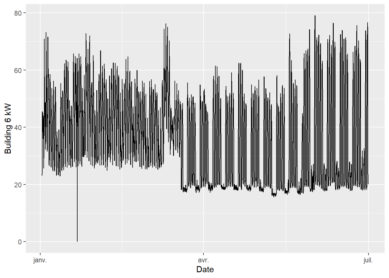
Figure 4.1: Pre-ECM data (first 6 months)
- The data has a hourly time step size. Every hour, the outdoor air temperature and energy use are available.
- The electricity use is higher in summer and in winter than in mid-season. This suggests that this consumption data includes both heating and cooling appliances.
- Week-ends are clearly visible with a lower consumption than in the working days of the week.
4.1.2 Subset selection
Averaging the data over daily time steps should allow to overlook the dependence between consecutive measurements. In turn, this allows using a model which will be much simpler than time series models, but will only be capable of low frequency predictions.
The following block creates new datasets from the original ones:
- Measurements are daily averaged
- A categorical variable is added to indicate week ends.
Then, we plot the daily energy use \(E\) (kWh) versus the outdoor temperature \(T\) (°C) for both values of the week.end categorical variable in the “pre” dataset.
daily.average <- function(df) {
  df %>%
    mutate(day = as_date(Date)) %>%
    group_by(day) %>%
    summarise(T = (mean(OAT)-32)/1.8,
              E = sum(`Building 6 kW`),
              .groups = 'drop') %>%
    mutate(wday = wday(day),
           week.end = wday==1 | wday==7)
}

df.pre.day  <- daily.average(df.pre)
df.dur.day  <- daily.average(df.dur)
df.post.day <- daily.average(df.post)

ggplot(data = df.pre.day) +
  geom_point(mapping = aes(x=T, y=E, color=week.end))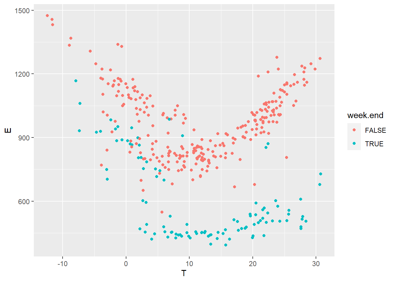
Figure 4.2: Daily electricity use vs outdoor temperature
It seems fitting to train separate models for the working days and the week ends, because the energy use is clearly different between the two sets. In this tutorial, we will only consider working days, as there aren’t many available data points for the week ends, but it is possible to do both.
Finally we filter out weekends and compare all three datasets in terms of energy use versus outdoor temperature:
df.pre.day  <- df.pre.day  %>% filter(!week.end) %>% mutate(period = 'pre')
df.dur.day  <- df.dur.day  %>% filter(!week.end) %>% mutate(period = 'during')
df.post.day <- df.post.day %>% filter(!week.end) %>% mutate(period = 'post')

df.all <- bind_rows(df.pre.day, df.dur.day, df.post.day)

ggplot(data = df.all, aes(x=T, y=E, color=period)) + geom_point()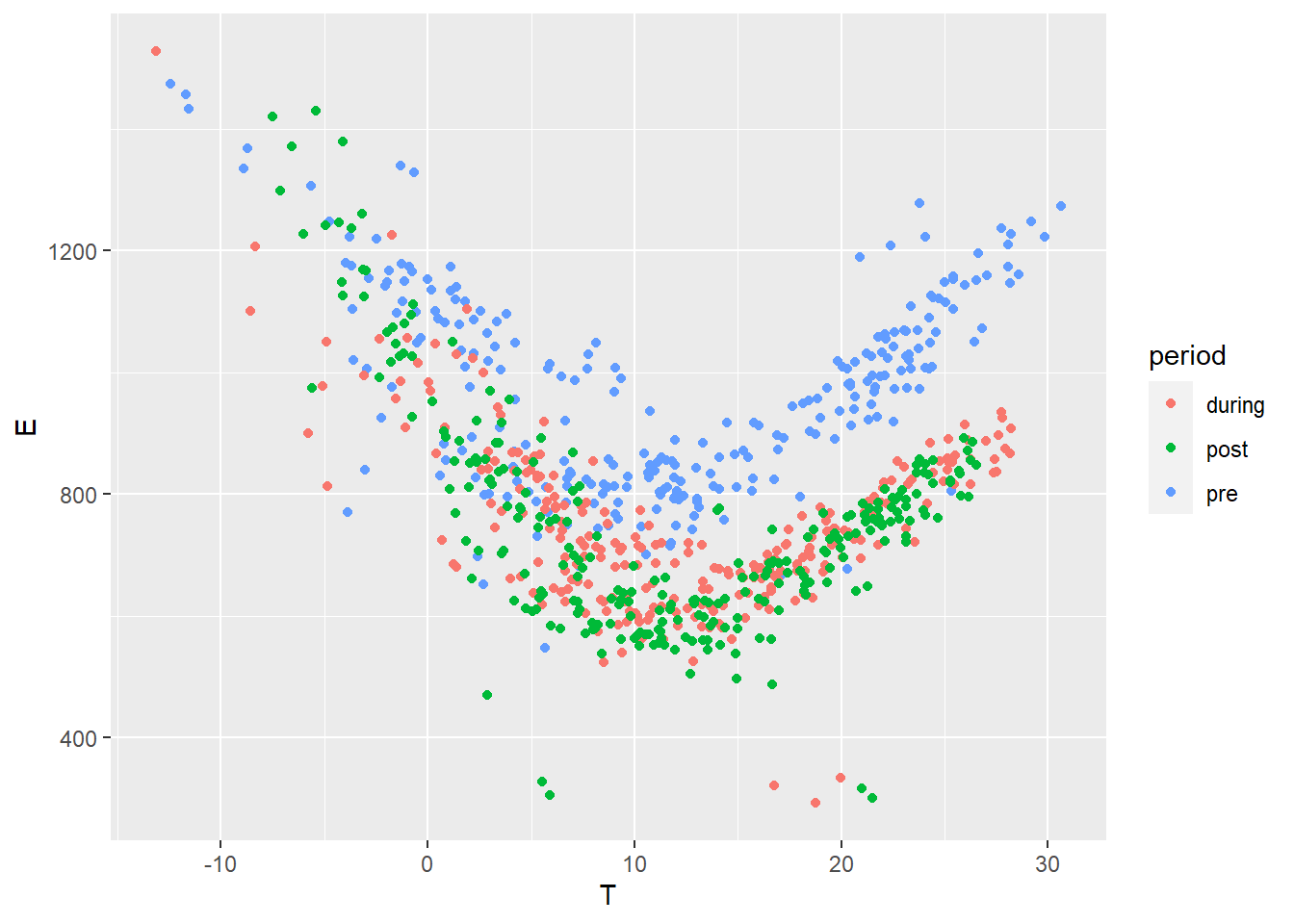
Figure 4.3: Daily electricity use vs outdoor temperature, selected data in three periods
4.2 Modelling and training
4.2.1 Model specification
After looking at the data, we can suggest using a change-point model which will include the effects of heating and cooling separately. The expected daily energy use \(y\) (in kWh per day) is a function of the outdoor temperature \(x\) and of a number of parameters:
\[\begin{align} y_n & = \alpha + \beta_{h}(\tau_{h}-x_n)^+ + \beta_{c}(x_n-\tau_{c})^+ + \varepsilon_n \tag{4.1} \\ \varepsilon_n & \sim \mathrm{normal}\left(0, \sigma\right) \tag{4.2} \end{align}\]
Where the \(h\) and \(c\) subscripts indicate heating and cooling modes. The \(+\) superscript indicates that a term is only applied if above zero. This equation means that we expect the energy use \(y\) to be a normal distribution centered around a change-point model, with a constant standard deviation \(\sigma\).
This model has 6 possible parameters: a constant term \(\alpha\), two slopes \(\beta\), two change points \(\tau\) and the error scale \(\sigma\). It is not an ordinary linear regression models: there is no analytical way to formulate the prediction uncertainty while accounting for the uncertainty of the change point estimates.
4.2.2 Model specification with Stan
The Stan code for the full model is written in a separate file changepoint.stan. We only show some parts of it here. See Tutorial 1 for a quick introduction on the components of a Stan model.
The names of data variables and parameters are declared in the data and parameter blocks which we don’t show here. These names should be clear from the above specification of the model. Here is the model block:
model {
  // Assigning prior distributions on some parameters
  alpha ~ normal(800, 100);
  tau_h ~ normal(8, 5);
  tau_c ~ normal(18, 5);
  beta_h ~ normal(40, 15);
  beta_c ~ normal(40, 15);
  // Observational model
  for (n in 1:N_pre) {
    y_pre[n] ~ normal(alpha + beta_h * fmax(tau_h-x_pre[n], 0)
                            + beta_c * fmax(x_pre[n]-tau_c, 0), sigma);
  }
}
The main difference with our first tutorial is that we added prior distributions on the parameters. They help regularizing the inverse problem because it may have a non-unique set of solutions. By adding the priors, we “help” traces converge towards physically consistent values that we chose after looking at the data.
There is also a generated quantities block:
generated quantities {
  // This block is for posterior predictions. It is not part of model training
  vector[N_pre] y_pre_pred;
  vector[N_post] y_post_pred;
  real savings = 0;

  for (n in 1:N_pre) {
    y_pre_pred[n] = normal_rng(alpha + beta_h * fmax(tau_h-x_pre[n], 0)
                                     + beta_c * fmax(x_pre[n]-tau_c, 0), sigma);
  }

  for (n in 1:N_post) {
    y_post_pred[n] = normal_rng(alpha + beta_h * fmax(tau_h-x_post[n], 0)
                                      + beta_c * fmax(x_post[n]-tau_c, 0), sigma);
    savings += y_post_pred[n] - y_post[n];
  }
}
This block handles the calculation of some posterior variables we want to watch: energy use predictions by the model during the “pre” and “post” periods, and energy savings.
Note that predictions are calculated by drawing from a Normal distribution with the \(\sigma\) error of each sample. Therefore, we will obtain a full description of the prediction intervals.
4.2.3 Model fitting
The next step is to create a list called model_data, which maps our data to each appropriate variable into the Stan model.
Then the stan() command fits the model, given in the changepoint.stan file, using this data.
model_data <- list(
  N_pre = nrow(df.pre.day),
  x_pre = df.pre.day$T,
  y_pre = df.pre.day$E,
  N_post = nrow(df.post.day),
  x_post = df.post.day$T,
  y_post = df.post.day$E
)

# Fitting the model
fit <- stan(
  file = 'models/changepoint.stan',  # Stan program
  data = model_data,        # named list of data
  chains = 4,               # number of Markov chains
  warmup = 1000,            # number of warmup iterations per chain
  iter = 2000,              # total number of iterations per chain
  cores = 2,                # number of cores (could use one per chain)
  refresh = 0,              # progress not shown
)
As in the first tutorial, fitting may result in a number of warnings, telling us that some problems may have occurred: divergent transitions, large R-hat values, low Effective Sample Size… Obtaining a fit without these warnings takes some practice but is essential for an unbiased interpretation of the inferred variables and predictions.
A lot of problems can be solved with an appropriate choice of priors.
4.3 Results
4.3.1 First look at results
The first look we can have at our results comes from the print, plot and pairs methods associated with the fit object:
## Inference for Stan model: changepoint.
## 4 chains, each with iter=2000; warmup=1000; thin=1;
## post-warmup draws per chain=1000, total post-warmup draws=4000.
##
##             mean se_mean      sd     2.5%      25%      50%      75%    97.5%
## alpha     829.64    0.24   11.88   804.68   822.03   829.99   837.98   851.42
## beta_h     33.37    0.06    2.68    28.19    31.55    33.38    35.15    38.67
## tau_h       6.51    0.02    0.75     5.23     5.98     6.45     6.97     8.15
## beta_c     29.26    0.07    3.24    23.16    27.02    29.11    31.42    35.84
## tau_c      15.78    0.02    0.98    13.70    15.16    15.84    16.47    17.50
## sigma      96.70    0.08    4.34    88.56    93.79    96.55    99.58   105.64
## savings 49922.98   35.51 2253.21 45425.69 48464.88 49899.17 51406.99 54365.56
##         n_eff Rhat
## alpha    2377    1
## beta_h   2256    1
## tau_h    1790    1
## beta_c   2451    1
## tau_c    2068    1
## sigma    3256    1
## savings  4027    1
##
## Samples were drawn using NUTS(diag_e) at Thu Mar 30 15:15:55 2023.
## For each parameter, n_eff is a crude measure of effective sample size,
## and Rhat is the potential scale reduction factor on split chains (at
## convergence, Rhat=1).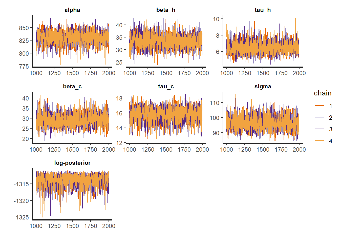
## Warning in par(usr): argument 1 does not name a graphical parameter

## Warning in par(usr): argument 1 does not name a graphical parameter

## Warning in par(usr): argument 1 does not name a graphical parameter

## Warning in par(usr): argument 1 does not name a graphical parameter

## Warning in par(usr): argument 1 does not name a graphical parameter

## Warning in par(usr): argument 1 does not name a graphical parameter

## Warning in par(usr): argument 1 does not name a graphical parameter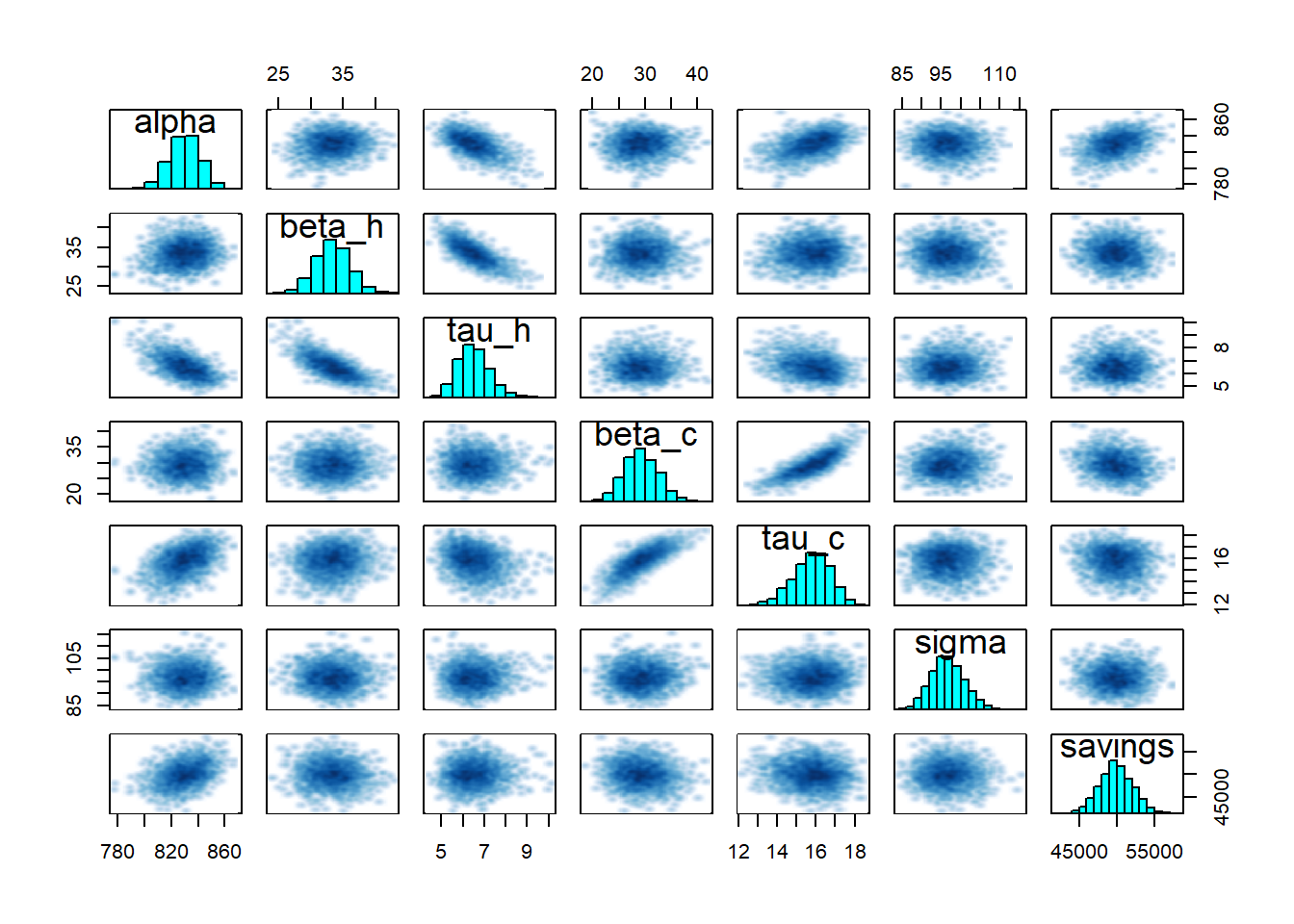
- Inference diagnostics are fine: for all parameters,
n_effis in the thousands andRhatis 1. - All model parameters are statistically significant: as their 95% confidence interval doesn’t include zero.
- All traces have converged to the same range.
- The pairplot suggests a strong correlation between some parameters, but nothing alarming.
4.3.2 Model checking
The model checking metrics are the same as usual: coefficient of determination \(R^2\), CV(RMSE), F-statistic… Here we calculate them only from the mean prediction rather than the full posterior distribution.
la <- rstan::extract(fit, permuted = TRUE)
predict.mean <- colMeans(la$y_pre_pred)

residuals <- predict.mean - df.pre.day$E      # residuals
ssres <- sum(residuals^2)                     # sum of squared residuals
sstot <- sum((df.pre.day$E-mean(df.pre.day$E))^2) # total sum of squares

R2 <- 1 - ssres / sstot   # coefficient of determination
CVRMSE <- sqrt(ssres / nrow(df.pre.day)) / mean(df.pre.day$E)

print(paste("R2 =", R2))
print(paste("CV(RMSE) =", CVRMSE))
## [1] "R2 = 0.658934362997056"
## [1] "CV(RMSE) = 0.0983950183032571"Then we check for parameter adequacy with a \(p\)-test:
# Trace of all parameters and generated quantities
traces <- as.data.frame(fit)
# Only the parameters
traces.p <- traces %>% select('alpha', 'beta_h', 'beta_c', 'tau_h', 'tau_c', 'sigma')

# The t-statistic is the ratio of mean to standard deviation of parameters
t_stat <- colMeans(traces.p) / sapply(traces.p, sd)
# The p-value is easy to calculate from the t statistics
ptest <- 2*pt(-abs(t_stat), df=nrow(df.pre.day))

print(ptest)
## alpha beta_h beta_c tau_h tau_c
## 1.659427e-170 2.739440e-28 4.183726e-17 5.011267e-16 3.331417e-41
## sigma
## 3.747296e-624.3.3 Predictions and savings
Our Stan model already calculates the expected output \(y\) of the reporting period, for each sample \(\theta_i\) of the posterior distribution. We can therefore display a probability distribution for each of the data points of the reporting period, and compare it with the measured data in the same period.
The following graph compares the energy use measured during the reporting period (points) with the probability distributions of energy use predicted by the model during the same period.
# This method is more convenient to extract prediction quantiles and mean
predict.quan <- apply(la$y_post_pred, 2, quantile, probs=c(0.025, 0.5, 0.975))

# Adding prediction quantiles to the baseline dataframe
df.post.day <- df.post.day %>% mutate(pred_low = predict.quan[1, ],
                                    pred_med = predict.quan[2, ],
                                    pred_up = predict.quan[3, ])

# Plot
ggplot(data = df.post.day) +
  geom_point(mapping = aes(x=T, y=E)) +
  geom_line(mapping = aes(x=T, y=pred_med), color='red') +
  geom_ribbon(mapping = aes(x=T, ymin=pred_low, ymax=pred_up), fill='red', alpha=0.1)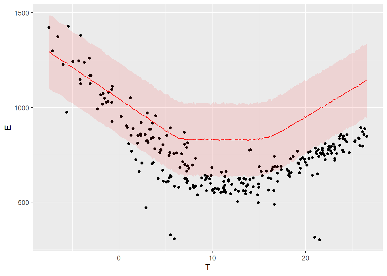
Figure 4.4: Model predictions and measurements in the post period
The colored bands show a 95% prediction interval. The points are the measurements of the “post” period.
The savings, i.e. the difference between the measured energy use during the reporting period and their prediction by the model, have been included in the Stan model as well. Similarly to the prediction, the savings are therefore available as a probability distribution: we have a full description of any confidence interval we may wish for.
We can also choose to display any quantile of the posterior distribution of savings. This line displays the mean expected savings and the bounds of their 80% and 95% intervals:
##     2.5%      10%      50%      90%    97.5%
## 45425.69 47046.76 49899.17 52841.86 54365.56
4.4 Residuals
There is one thing we didn’t check.
An important validation step is to check for autocorrelation in the residuals of the fitted model, on the baseline data that was used for fitting. Autocorrelation is often a sign of insufficient model complexity, or that the form of the model error term has not been appropriately chosen. In case of strong remaining autocorrelation, inferences should be drawn with caution.
The autocorrelation function (ACF) is the easiest way to display autocorrelation of the variable residuals:
acf(residuals)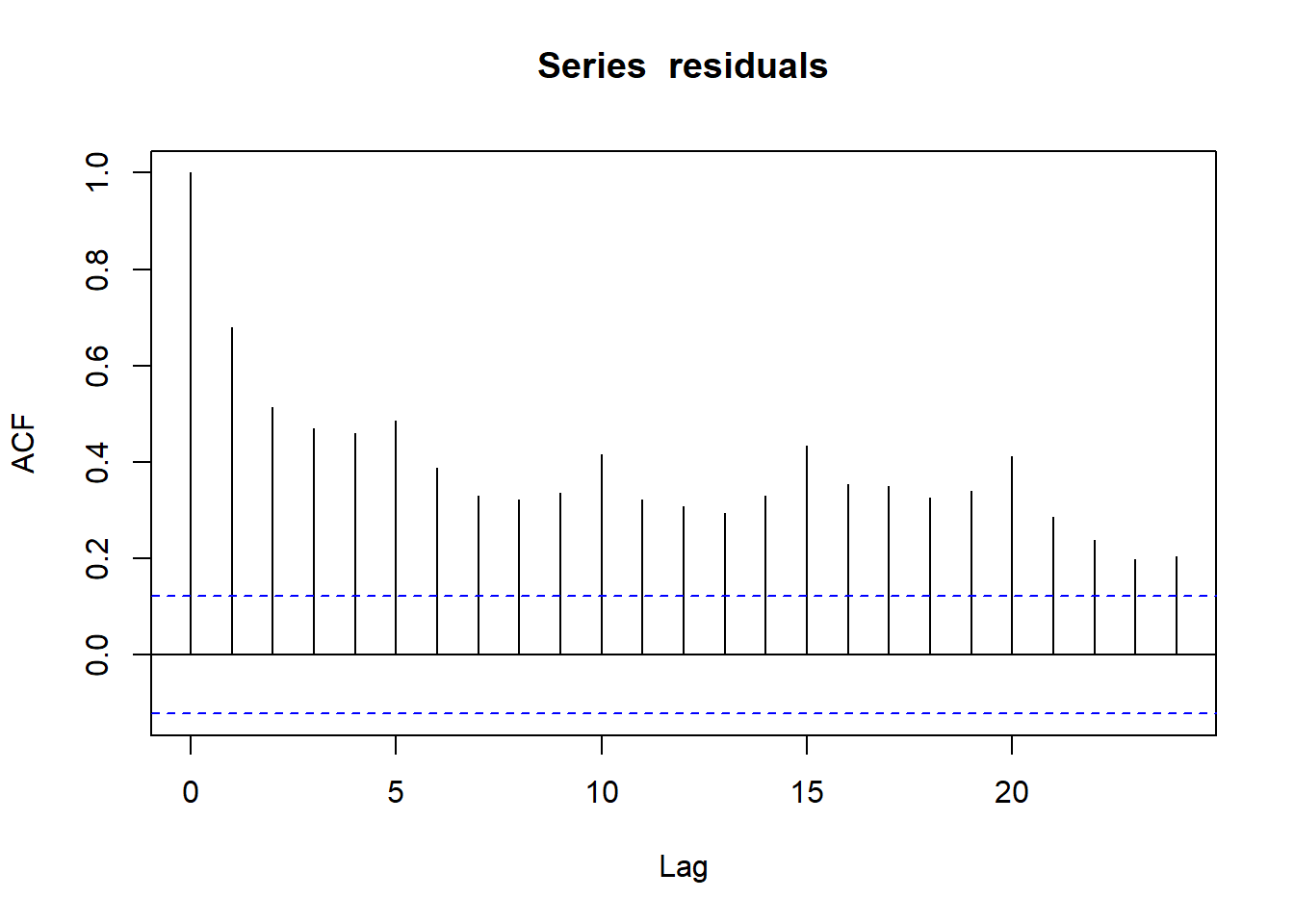
Figure 4.5: Autocorrelation function of prediction residuals
Every vertical line of this graph shows the correlation coefficient between the values of a series (here residuals) and its own values with a certain lag.
- For
Lag=0, the ACF is 1. This is normal: a series is fully correlated with itself. - As much as possible, we want all other ACF values below the dotted line, a threshold value which depends on the length of data.
- For
Lag=1, the ACF is close to 0.7. This is the average correlation coefficient between residuals and their own previous value. As a consequence, the next lags have high ACF values as well. - There is an increased ACF every 5 lags. Reminder: we removed weekends, therefore our dataset has 5 rows per week. The data has a weekly pattern that our model doesn’t capture.
We can zoom in on the lag-1 autocorrelation by plotting residuals versus their own previous value:
ggplot() +
  geom_point(mapping = aes(x=residuals, y=lag(residuals, n=1, default=0)))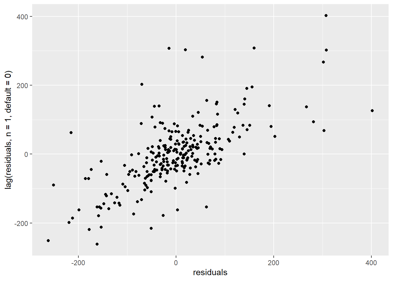
Figure 4.6: Correlation of consecutive residuals
The autocorrelation graph suggests that our model doesn’t predict the variability of the data properly. We should therefore be very cautious when interpreting its inferences. This includes the uncertainty of the savings estimates.
In order to trust our inferences, we have two options:
- Improve the model so that it better describes the building’s electricity use and its dependency on weather and occupancy. This means more model parameters, but the dataset may no longer bring enough information to identify them.
- Modify the model to account for an additional uncertainty due to the autocorrelation. This means we will not “fix” the model, but let it aknowledge that it is missing something: inferences will be more “cautious” (more uncertain but more reliable).
In the next tutorial, we show how to do the second option.